Many creators treat vlog thumbnails as an afterthought. They pull a random screenshot from the video, slap some text on it, and hope for the best. However, a successful vlog thumbnail relies on capturing a specific emotion and a singular moment, not visual chaos.
How Are Vlog Thumbnails Different?
Designing a thumbnail for a vlog requires a completely different approach than designing one for a tech review or a finance tutorial. Educational videos sell information. Vlogs sell stories and personalities.
You Are the Product
In a vlog, you serve as the main attraction. Your face, your emotions, and your personality drive the clicks. Viewers do not click to see the coffee shop you visited; they click to see your reaction to dropping your coffee. Putting yourself front and center builds a parasocial relationship with your audience.
Story Over Information
A tech review thumbnail might simply show an iPhone and the text "Worth It?". A vlog thumbnail needs to hint at a narrative. It should not just show what the video is about; it must show what actually happened. The visual needs to spark a question in the viewer's mind.
Natural vs. Exaggerated
Vlog viewers value authenticity. While you need to grab attention, you must balance genuine emotion with visual appeal. A highly over edited, polished graphic often performs worse for a vlog than a raw, slightly chaotic frame that feels real and authentic.
What Makes a Vlog Thumbnail Clickable?
To improve vlog CTR, you must understand what makes a human thumb stop scrolling. High performing designs usually share four key traits.
Emotion on the Front Line
Reaction beats aesthetics every single time. A blurry picture of you laughing uncontrollably will pull more clicks than a perfectly lit, boring portrait. Human beings naturally mirror the emotions they see in others. Show them how to feel before they even click.
One Specific Moment
Your vlog might cover a full 24-hour day, but your thumbnail should only highlight the single most exciting second of that day. Do not try to cram your breakfast, your gym session, and your evening party into one graphic. Pick the highlight reel.
The Curiosity Gap
A great thumbnail creates a gap between what the viewer knows and what they want to find out. If you show a picture of yourself looking shocked while holding a mysterious box, the viewer has to click to see what sits inside the box.
One Second Readability
Viewers process images in less than a second. If your design features too much clutter, the eye gets confused, and the viewer keeps scrolling. Simplicity and clarity reign supreme.
Step by Step: How to Create Vlog Thumbnails
Follow these practical vlog thumbnail tips every time you prepare a new upload.
Step 1: Pick One Moment from the Vlog
Scan your footage and find the most emotional or interesting frame. Look for high stakes, funny situations, or moments of genuine surprise. This single frame will serve as the foundation of your design.
Step 2: Choose a Strong Face Shot
Your facial expression must sell the moment. Whether you show shock, joy, confusion, or fear, make sure the emotion reads clearly. If the original frame does not have a clear view of your face, consider posing for a quick photo after you finish filming the scene.
Step 3: Remove the Clutter
Take your chosen image into your editing software and simplify the background. You can slightly blur the background to separate yourself from the environment. Remove any distracting elements, like trash cans or random street signs, that pull the eye away from the main action.
Step 4: Add Contrast
Contrast forces your subject to stand out. Boost the saturation slightly, brighten the exposure on your face, and ensure you separate clearly from the background. Good lighting and color contrast stop the scroll.
Step 5: Add Text (Optional)
You do not always need text on a vlog thumbnail. If you do use it, keep it strictly between one and three words. The text should never repeat the title. Instead, use it to add curiosity or context to the visual.
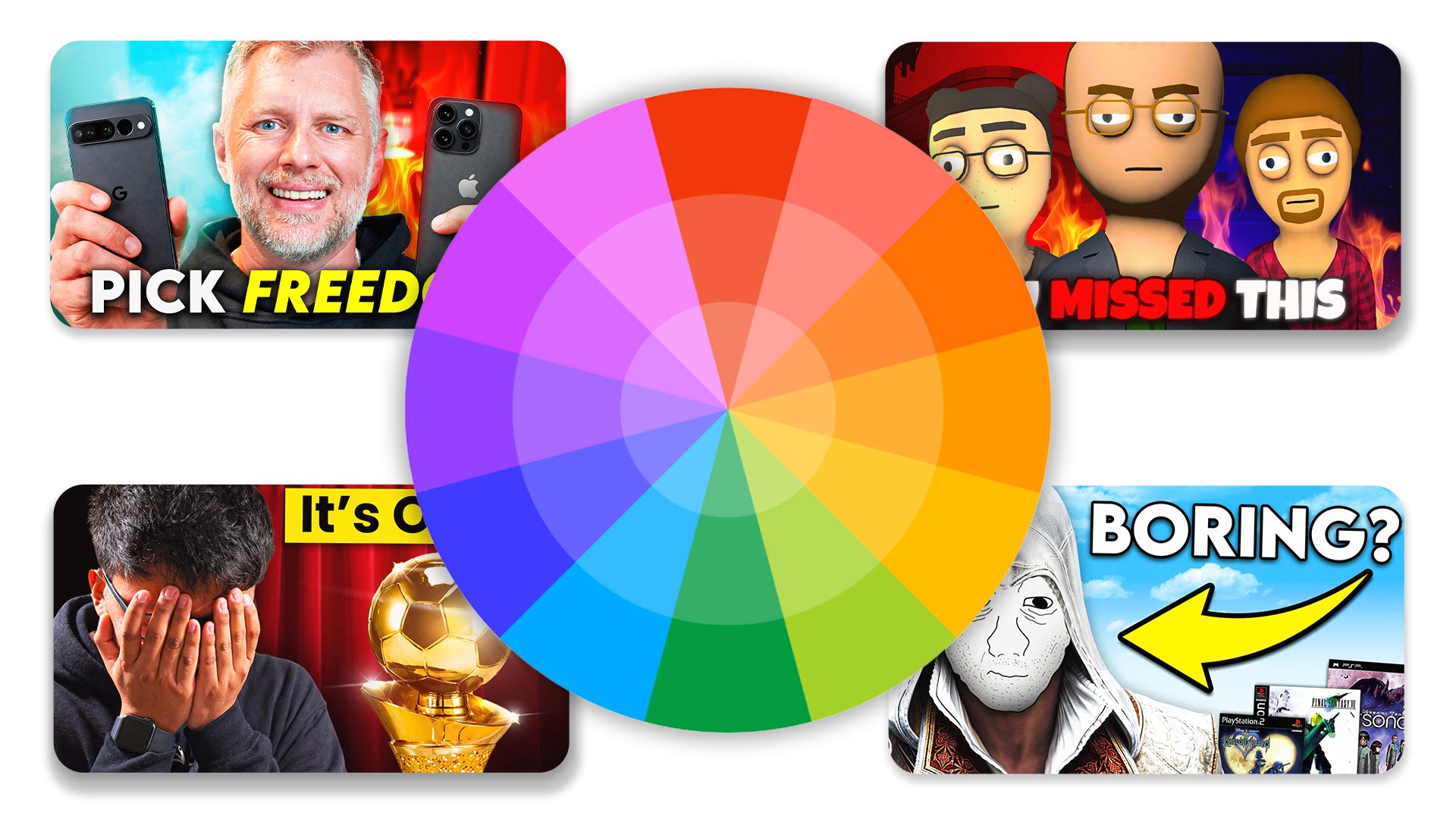
Best Vlog Thumbnail Styles
If you need inspiration, try testing out the best vlog thumbnail styles currently dominating the platform.
Face + Situation
This classic style features a large cutout of your reacting face placed over a background that shows the context of the situation. It works incredibly well for travel vlogs or challenge videos.
Caught in the Moment
This style looks like an accidental photo taken at the exact right time. It feels raw, unedited, and highly authentic. Viewers love this style because it feels like peering behind the curtain into your real life.
Minimalist Style
This approach uses a very clean, simple background with one clear emotion on display. It strips away all context, forcing the viewer to rely entirely on the title and your facial expression to figure out what the video is about.
Common Mistakes
Avoid these frequent errors that destroy your click-through rate.
Too Much Going On
When you include multiple photos, text boxes, and arrows in one small graphic, you eliminate your focal point. The viewer's eye bounces around and gets overwhelmed. Keep it simple.
Zero Emotion
A blank, neutral stare will not convince anyone to give you 15 minutes of their time. If your face looks bored, the viewer assumes the video is boring.
Weak Contrast
If you wear a dark shirt against a dark wall, you disappear into the app's dark mode interface. You must use lighting and color to pop off the screen.
Repeating the Title in the Text
If your video title is "I Moved to New York," do not write "Moving to New York" on your thumbnail. That wastes valuable real estate. Instead, write something like "Huge Mistake?" to build intrigue.
How to Improve CTR on Vlogs
Once you master the basics, you can start optimizing for even better results.
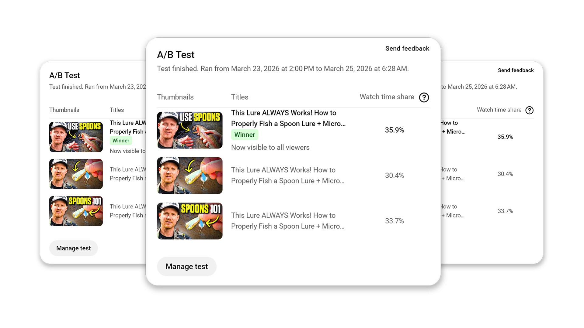
Test Different Emotions
YouTube now allows you to A/B test thumbnails. Use this feature to test different reactions to the exact same scene. See if your audience prefers a shocked face or a happy face for a specific type of video.
Test Text vs. No Text
Run experiments to see if your audience responds better to clean visuals or text-heavy designs. Many top vloggers have transitioned to zero text because it makes the image feel more cinematic.
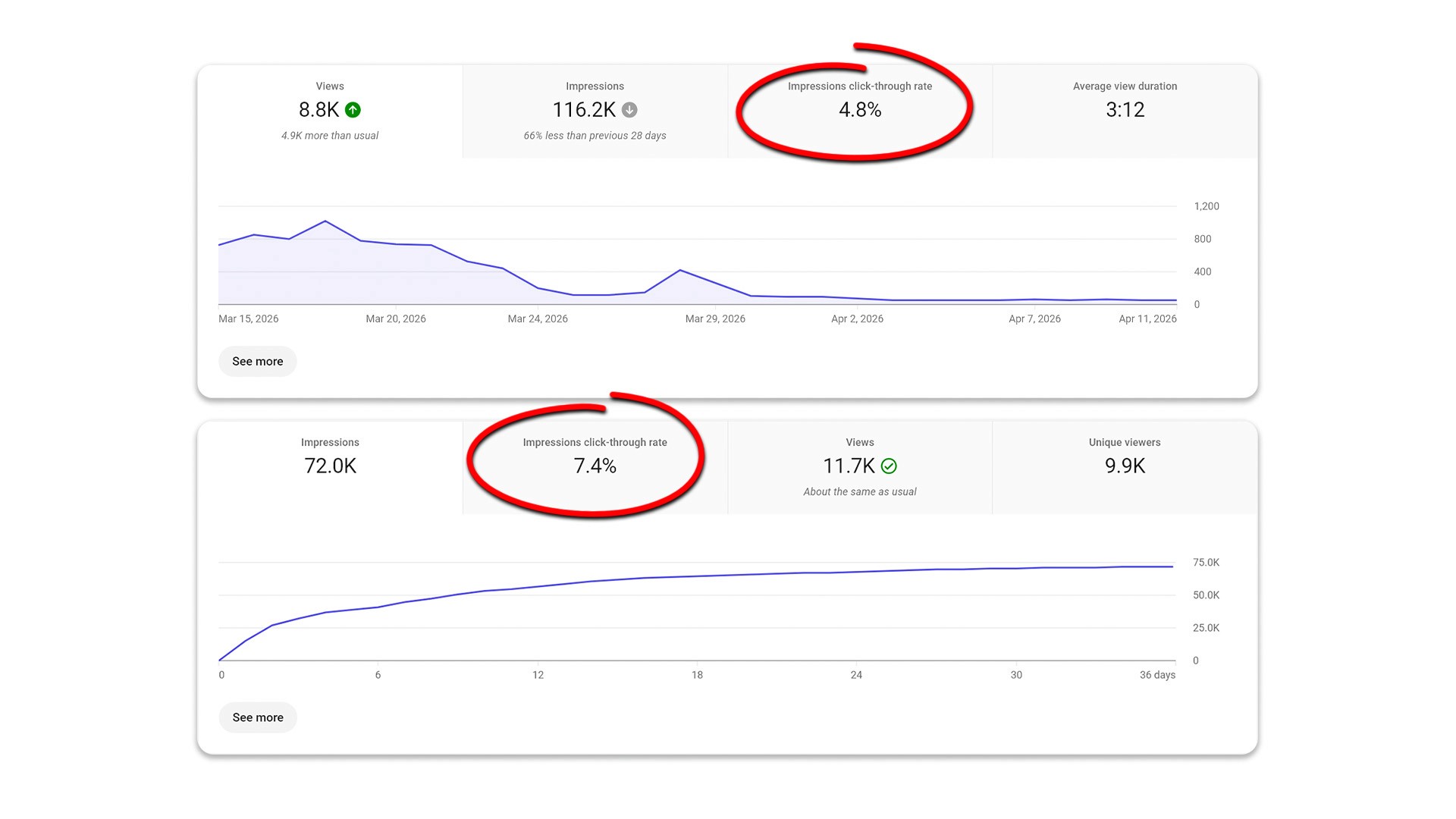
Analyze CTR and Retention
Always read your data. A high CTR means your thumbnail worked. However, if your retention drops immediately, you created a misleading clickbait thumbnail. Aim for designs that accurately represent the vibe of your actual video.
Final Thoughts
Creating successful vlog thumbnails comes down to mastering emotion and simplicity. You do not need to show the viewer everything that happens in your day; you just need to show them one compelling moment. Stop guessing what works and start testing different styles. Focus on building curiosity, and watch your channel grow.
Frequently Asked Questions
How do I make a good vlog thumbnail?
Focus on a single, highly emotional moment from your video. Ensure your face is clearly visible, simplify the background, and use contrast to make the image pop.
Do I have to add text?
No. Many of the most successful vlog thumbnails use zero text. If you do use text, limit it to one to three words that build curiosity.
What emotions work best?
Surprise, joy, shock, and confusion tend to generate the highest click-through rates because they provoke strong curiosity.
Why do my vlogs have a low CTR?
Low CTR usually stems from cluttered designs, lack of clear emotion, weak contrast, or a failure to create a curiosity gap between the title and the image.
Do vlog thumbnails need to look aesthetic?
No. They need to be readable and highly clickable. A raw, authentic frame often performs much better than a heavily polished, artificial design.
Recent Blog