Why Color and Contrast Matter in YouTube Thumbnails
Viewers do not read YouTube. They scan it. Understanding how this scanning behavior works is the first step toward building a more clickable channel.
How Viewers Scan Thumbnails
When a user scrolls through their homepage, they make split second decisions. The average viewer decides whether to stop scrolling in less than one second. During that brief window, their eyes instinctively search for simplicity and strong visual differences.
If your design requires viewers to squint or think, they will keep scrolling. You must deliver a clear, instantaneous message. Bold visual choices help you interrupt the scroll and secure that crucial second of attention.
How Color Affects Click Behavior
Colors grab human attention much faster than text ever could. Before a viewer reads a single word of your title, their brain processes the hues on their screen. This immediate psychological reaction can either draw them in or push them away.
Using the right shades helps your content pop out from the crowded, often chaotic subscription feed. When you establish a distinct color palette, you also build brand recognition. Over time, loyal viewers will spot your specific color choices and click out of habit.
Contrast = Visibility
Contrast is the engine that makes your colors work. Without strong contrast in thumbnails, your design essentially disappears into the background of the platform. The dark mode or light mode interface of the app will swallow up weak designs. You must force your main subject to break away from the background.
The Basics of Color in Thumbnails
You do not need an art degree to master thumbnail design. You just need to understand a few fundamental rules about how colors interact.
Use a Limited Color Palette
Amateur designers often make the mistake of using every color in the rainbow. This creates visual chaos. Instead, limit your palette to two to four main colors per design.
A restricted palette forces you to make intentional choices. It directs the viewer's eye exactly where you want it to go. By keeping your color count low, you maintain a clean, professional look that feels easy to digest.
Color Roles (What Each Color Does)
Different colors trigger different emotional responses. While there is no single magic shade, you can leverage psychology to pick the best colors for YouTube thumbnails based on your topic.
Red: Signals urgency, danger, or high energy. It stops the eye immediately.
Green: Represents success, wealth, or a positive outcome.
Yellow: Grabs attention and highlights crucial information. It works perfectly for bold text or arrows.
Blue: Builds trust, calmness, and authority. It often works well for educational content or tutorials.
Background vs Subject Colors
Your background has one job: to make the main subject look good. The background should support the narrative, not dominate the frame.
Always ensure your subject stands completely apart from what sits behind them. If your subject wears a dark blue shirt, do not place them against a dark blue wall. The subject must remain the absolute star of the image.
How to Use Contrast to Increase Clicks
Contrast simply means difference. The bigger the difference between two elements, the more attention they attract. Here are the most effective ways to apply this principle.
Light vs Dark Contrast
This remains the most reliable technique in thumbnail design. Placing a brightly lit subject against a dark background almost always works.
The human eye naturally gravitates toward the brightest part of an image. If you darken your background slightly and boost the brightness on a face or an object, you create an instant focal point.
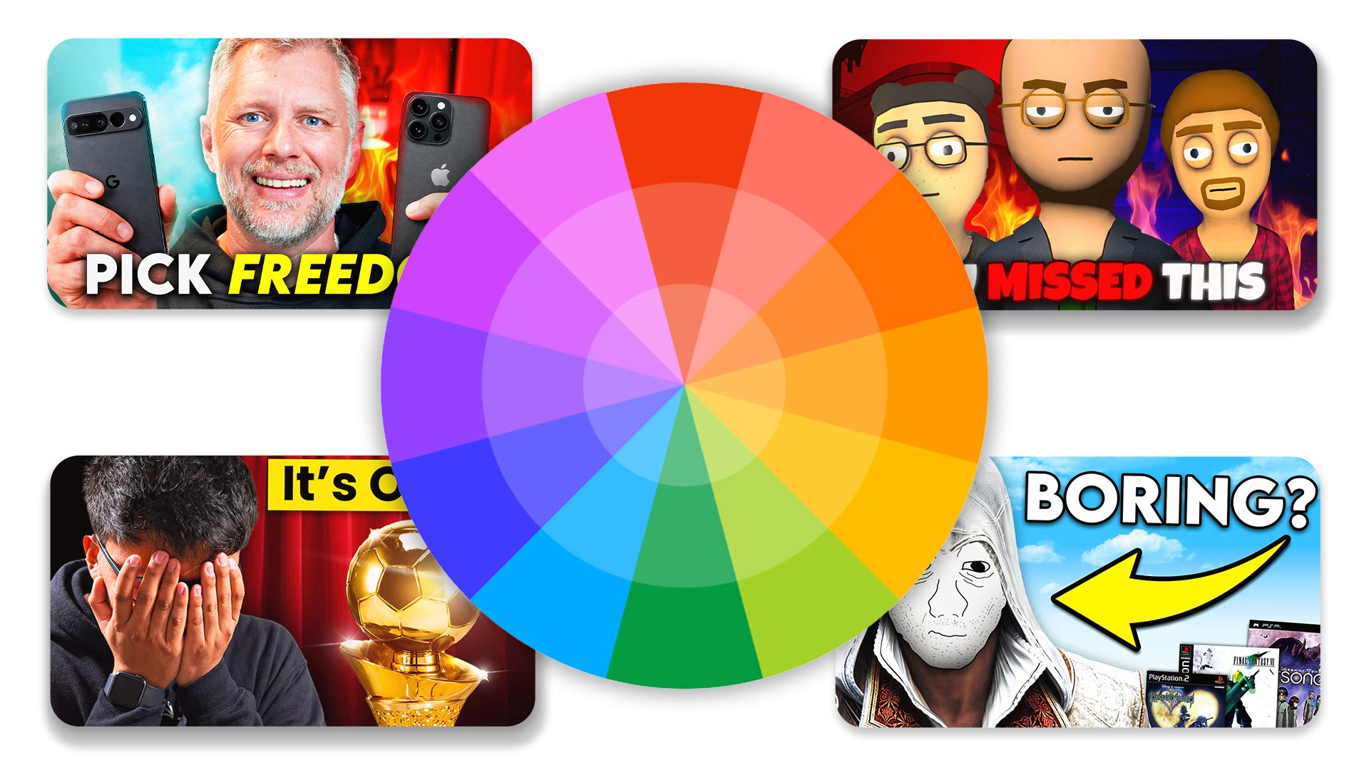
Color Contrast (Opposites)
You can also create friction by placing opposite colors next to each other. These are known as complementary colors on the color wheel.
Pairing blue with orange creates a vibrant, eye-catching dynamic that dominates the platform. Similarly, placing red next to green generates intense visual energy. Use these pairings when you want an element to scream for attention.
Size Contrast
Contrast does not only apply to color. You can use size to show viewers what matters most.
Placing a massive object next to a tiny object creates immediate intrigue. If you review a tiny microphone, holding it close to the camera while keeping your face small in the background emphasizes the product's size.
Conceptual Contrast
Some of the highest performing designs use conceptual contrast to tell a story. This involves showing two opposing ideas in one frame.
Showcasing a "before vs after" scenario immediately promises a transformation. Highlighting "success vs failure" or "expectation vs reality" triggers intense curiosity. This visual storytelling promises a payoff if the user clicks to watch the video.
Practical Framework for Better Thumbnails
Now that you understand the theory, let us apply it. Use these practical YouTube thumbnail tips every time you sit down to create a new design.
Step 1: Pick One Focal Point
Decide on the single most important element of your design. This could be an expressive face, a unique object, or a bold word. Everything else in the image must point to, or support, this one focal point. Do not ask the viewer to look at three different things at once.
Step 2: Separate It From the Background
Once you have your focal point, detach it from the background. You can achieve this separation by applying a slight blur to the background image. You can also add a drop shadow or a glowing outline behind your main subject to push it forward.
Step 3: Add Strong Contrast
Inject contrast to make that focal point undeniable. Apply a bright, complementary color to your main element while keeping the background dark or desaturated. Alternatively, use conceptual contrast to set up a compelling visual story.
Step 4: Keep Text Minimal and Readable
If you use text, treat it as a visual element, not a sentence. Aim for zero to three words maximum. Choose a thick, bold font and apply a high-contrast color like yellow or white. Ensure the text remains perfectly legible against whatever sits behind it.
Step 5: Test at Small Size
Most viewers watch YouTube on their phones. A design that looks amazing on a 27-inch monitor might look like a muddy blur on a mobile screen. Always zoom out until your design is the size of a postage stamp. If you cannot easily identify the focal point, you need to add more contrast.
Common Color & Contrast Mistakes
Even experienced creators fall into a few predictable traps. Avoid these common errors to keep your click-through rates healthy.
Low Contrast Text
Never put dark text on a dark background or light text on a light background. If your audience has to squint to read your hook, they will simply scroll past. Always prioritize pure legibility over fancy font styles.
Too Many Colors
Throwing neon green, bright pink, red, and blue into one image destroys your visual hierarchy. When everything tries to stand out, nothing stands out. Stick to your limited palette to maintain clarity.
Everything Has Same Importance
If your face, the text, and the background elements are all the exact same size and brightness, you have no focal point. Your viewer's eye will bounce around the image, get confused, and leave. Establish a clear leader in your visual hierarchy.
Overediting
Adding too many light leaks, overlays, and extreme HDR effects ruins readability. While effects look cool during the editing process, they often create a messy final product. Prioritize clear, clean subjects over heavy special effects.
Final Thoughts
Mastering color and contrast serves as the simplest, most effective way to improve your click-through rate. You do not need to invent groundbreaking artistic concepts for every upload. You simply need to package your ideas clearly.
Always remember that visual simplicity beats complex creativity. Guide your viewer's eye exactly where you want it to go using light, dark, and complementary colors. Stop guessing what works, start testing these proven principles, and watch your channel grow.
Frequently Asked Questions
How important is color in YouTube thumbnails?
Very important. Color is one of the very first elements that catches the human eye, making it essential for stopping the scroll and securing a click.
What colors get the most clicks?
The colors that get the most clicks are those that have the highest contrast against their background. There is no single "best" color, but highly contrasting combinations work best.
How many colors should I use?
You should aim to use two to four main colors in a single design to avoid visual clutter and maintain a clear hierarchy.
Why do my thumbnails look good but don't get clicks?
Usually, this happens because of a lack of contrast and the absence of a clear focal point. A design can look artistic but still fail to communicate a clear, clickable idea.
Should I follow a color formula?
You can use standard formulas like complementary colors to start, but you should always test different combinations to see what resonates best with your specific audience.
Recent Blog